Book review of “Protest Kitchen” by Carol Adams and Virginia Messina, published 2018
- Mark Mathew Braunstein
- Jul 24, 2025
- 2 min read

This book’s writing is visionary, as expected, but this book’s formatting is short-sighted.
You can expect rave reviews to be contributed by family, friends, and fans of the authors, while bad reviews of books on the vegan diet and lifestyle might be lambasted by slaughterhouse workers with axes to grind and by butchers with bones to pick. So the truth is more likely to be found in a mixed review. Maybe such as this.
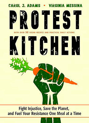
As a staunch vegan since 1970, so long ago that I've forgotten why I became one, I am a fan of the authors, one renowned for vegan philosophy and the other for vegan nutrition. I was especially attracted to the iconoclastic front cover image of the militant fist clenching a carrot. I could not resist its call to resist. Nor could I resist Protest Kitchen’s subtitle: Fight Injustice, Save the Planet, and Fuel Your Resistance One Meal at a Time.
I anticipated reading this book as a refresher course in vegan nutrition and lifestyle. Indeed, that course material abounds here, but I was unable to read much of it. Consider me an errant student who did not do his homework, and so for the exam (or the review) must fake having read the entire book. Because this book hurts my eyes!
My eyesight is fine, so I do not think I need to get my eyes examined. Perhaps the publisher and the book designer need to have their heads examined. The font is teeny tiny, the typeface is very delicately fine-lined, the ink is vegan green rather than jet black, and the inking is lightly applied, akin to “draft quality” as a printing option to save on the cost of toner ink for your home printer. The creme rather than white paper further exacerbates the problem. After half an hour, I had to stop reading out of frustration, not with the authors, but with the designer and publisher.
Agreed, this 244-page hardbound book is bargain priced. Its binding is actual sewn folios (not glued pages as simulated by some phony hardbound books). But the reader is not saving a penny if the book is illegible. Sure, its tiny type reduces the page count and therefore the price. Yet, the text occupies only half of the page, which bumps up the page count and thereby negates any benefit of tiny type. Worse, the widest margins are on the outer edges, but better belong along the inner edges, which in book design is unfortunately called the gutter.
But wait! A solution is at hand. Skip the printed book and instead purchase the eBook, for which you can enlarge the font size at will. And you can increase the contrast on your monitor to compensate for typeface’s faintness.
Please be aware that I am not faulting the authors, because most authors have little control over the look of their books. (Mine is the voice of experience.) But potential future authors signing on with this publisher, and potential future publishers hiring this book designer, please take heed!